Opera extensions generic icon template tutorial
Photoshop template
Download the template here if you haven't already, and open it in Photoshop.
 Figure 1. The opened template file in its default state. Consider saving it like this with a new name to allow for reusing it or backup purposes.
I can't draw!
A common misconception is that one has to be able to draw to be a designer. This is not true. It helps, but as in all other areas of life: one can cheat. For the purpose of this tutorial, I will assume you do not know anything about manipulating lines in the intent of creating a recognizable shape.
Most likely you won't need a unique icon shape for your extension, but can manage with generic clip art. The font set 'Webdings' is perfectly suited for this purpose. A simple letter from a nice font set is also something to consider. You will also probably be able to hunt down creative commons vector art on the web. I'm proceeding with the Webdings approach.
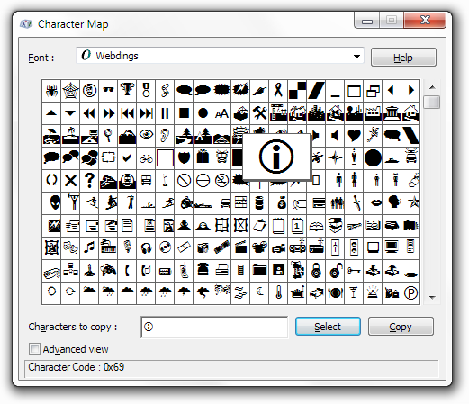
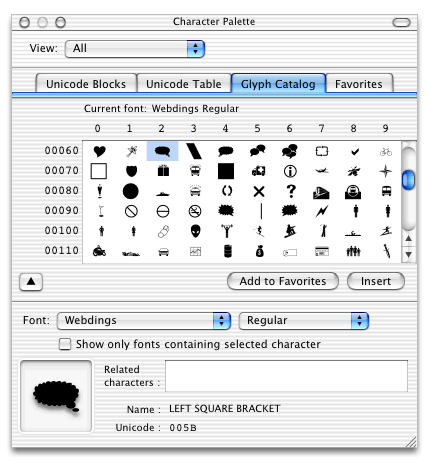 Figure 2. Webdings font in Windows and Mac cheats you right through the laborious task of creating something unique.
The template itself carries a brief walkthrough of its purpose. Feel free to race ahead if this becomes too detailed.
The icon shape layer
The first step is to equip the template with an icon shape. I decided on going for a neat cheat with the Webdings font, and to get started the text tool must be selected.
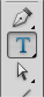 Figure 3. Find something resembling this T-shaped icon in your toolbox of Photoshop. It has changed slightly with different updates.
Make sure you have the 'icons' layer group selected and click anywhere to start writing. You can, as I did, click and drag to create a text box too but that's really just stupid in this case. Stupid me.
How you later plan on finding and deciding upon an icon I'll leave for you to decide, but to follow all the steps covered in this tutorial you'll need the 'i' icon from the Webdings font. I recommend you use this too, especially if vector tweaking is not your cup of coffee. In case you didn't find out yourself, the font selector is up on the toolbar along some common values. A more detailed control can be achieved by selecting 'Character' from the 'Window' drop down menu.
 Figure 4. Use a font for quickly applying an icon shape to your icon.
Nobody will hurt you if you do otherwise, but an elegant and proven way of making your icon look professional is to make it white on a colored background. Since this template is all about simplicity and premade backgrounds, I strongly suggest you stick with this too. If you apply a text color, make sure the text is selected first.
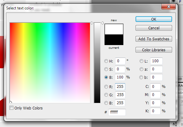 Figure 5. Use white for the icon shape to make the icon appear professional. Badly mixed colors is a sure way of ruining a nice piece of art.
In order to tweak your icon shape, you'll need to make it a vector shape layer. From the 'Layer' dropdown menu, select 'Type' and 'Convert to Shape' (the same can be achieved by right-clicking the type layer). This will make the letter, or in this case icon, into an editable vector shape with bezier curve points for you to play with.
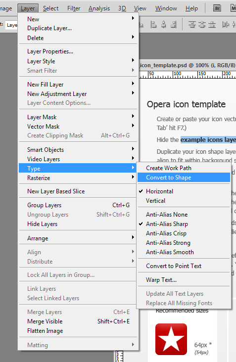 Figure 6. Converting the text to a vector shape will provide you with a fine grained control of it.
 Figure 7. An enlarged view of your webding turned vector shape.
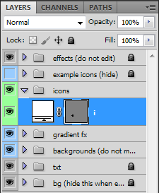 Figure 8. Your shape layer will now look like this. You can no longer edit the content with the text tool, but you can alter the shape of it.
Pixel sharp vectors
Now that you have an icon that you can work with, you need to place it and make it the correct size. First, simply drag it over the 64 px background shape with the 'Move Tool', then select 'Edit -> Free Transform' (or hit Ctrl-T) to make it just right. Make sure you have zoomed your view (Ctrl-+) enough to clearly see what's going on. While you can drag the corner or side boxes of the transform selection, I recommend you use the input fields up on the tool bar instead. This will ensure you hit whole pixel values and give you an overall much higher level of control.
 Figure 9. Placing the icon shape on the background shape with the 'Transform' tool.
First, you want to change the point from which the orientation of the icon shape is made. In the little 3x3 grid with a black box in the center, hit the top left corner box. This will make Photoshop orient your shape from the top left corner and is a bit easier to work with than the alternatives. Most likely your icon is neither placed on a whole pixel value on the x-axis, nor the y-axis. Change this now by rounding up or down. Don't bother with exact placement yet, as you probably want to change the size of your shape first.
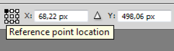 Figure 10. Use the transform input fields to maintain full control of what you're doing. Snapping in Photoshop can be a bit iffy at times.
In the next fields, W and H, you'll input whole pixel values too. By default these fields are set to percent, so you have to right click both of them in turn and selext 'pixels' from the dropdown. If you want to, you can click the little chain icon between the fields to maintain the aspect ratio of your icon, but in the example the values need to be set individually. Round your values up to a whole, preferrably even number resembling the one in the parenthesis in the template. In this case 54 px. Whether to maintain the aspect ratio or to round both aspects individually is something you'll have to decide on case by case. As a rule of thumb, I first scale the widest aspect to the desired size with aspect ratio locked, then release it and tweak the narrow aspect if needed. Usually pointy or curved sides can do without a perfect fit, while straight edges benefit from the little extra love.
When you're happy with the size, go back and center your icon shape on the background using the input fields. You should now see why even numbers are preferred.
 Figure 11. The rounded values make sure your shape is placed nicely on the pixel grid.
 Figure 12. The shape shapely placed on the pixel grid.
Pixel sharp vectors pt. 2
If you thought that was the end of it, I'm sorry to disappoint you. Because we just started. Zoom in a bit more, then look at your icon shape. It should be awful, and you should see why pretty clearly. If not, look below. Then back up here. Then at your icon. Then back here. See it now? See how those other vector shapes are clearly misbehaving? Good, because you're going to deal with it.
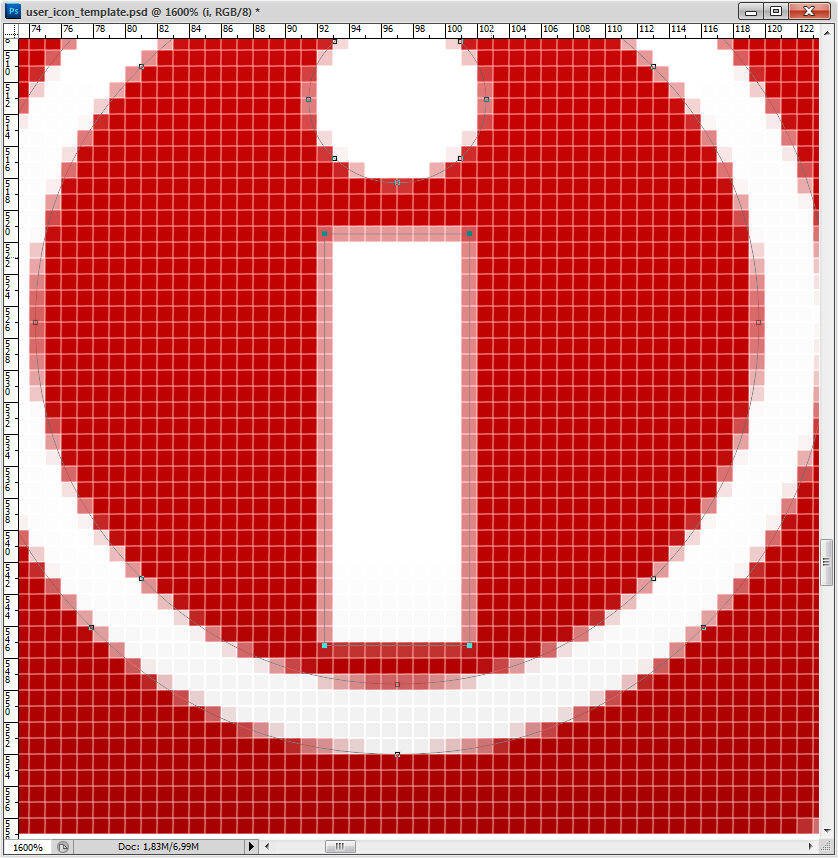 Figure 12. The icon details are not matching the pixel grid.
With the 'Direct Selection Tool' selected (A), click the corner vector points of the stem of the 'i' shape. If for some reason you cannot select it, you might have an underlaying shape selected. Find your shape in the 'Layers Tab' and select the shape again there. When you have all the corner points selected, simply repeat the process of free transforming by inputting values. Click Ctrl-T, select upper left reference point location, input whole numbers and hit 'Enter' on your keyboard.
 Figure 13. Individual shaping of the vector shapes within your icon shape.
Bam! That is so much better. Because those straight lines now perfectly fit the pixel grid, the shape will be sharp as a knife. As for the inside of the curved shape (the inside of the O), I'd ignore it. The benefit from tweaking this is simply not there. But the dot can easily be altered for some extra bonus points, so let's go on repeating the process for that one. Concider it a good exercise if nothing else.
 Figure 14. The shape is crispy clean. At least a part of it.
 Figure 15. Select the vector points of the dot ...
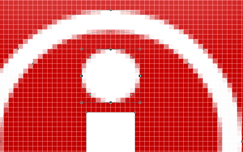 Figure 16. ... and make it fit the grid.
Small icons
Now the hard part.
For the 64x64 px icon you really can get away by not treating the pixels as carefully as described here, but for understanding the following it is easier if you're a bit familiar with the shapes making up your icon. It certainly doesn't hurt to go the extra mile, as the end result will be of professional quality (even better than it, actually). Let's start with duplicating the icon shape layer. This is easily done by simply holding the 'Alt' key pressed while dragging the icon with the 'Move Tool' active. Free transform the layer shape (Ctrl-T) to be 16x16 px.
 Figure 17. Duplicate the icon shape layer and move and scale it to fit the 18 px background shape.
Let's zoom in on that new icon shape. Ouch! Here we have work to do.
 Figure 18. Zooming in on the small icon reveals problems.
The nice thing about working with vectors like this and bitmap files is that you can see how the shape would have looked in a higher resolution. In our example, we can see (and know from the previous resolution) that the dot of the 'i' is slightly wider than the stem. Deciding whether to keep a feature like this or not must be decided upon for the individual shape, but in this case it's very useful to know.
But before we're proceeding here let's have a little dive into the Photoshop settings. Hit 'Edit -> Preferences' and find 'Guides, Grid & Slices'. Change it to this:
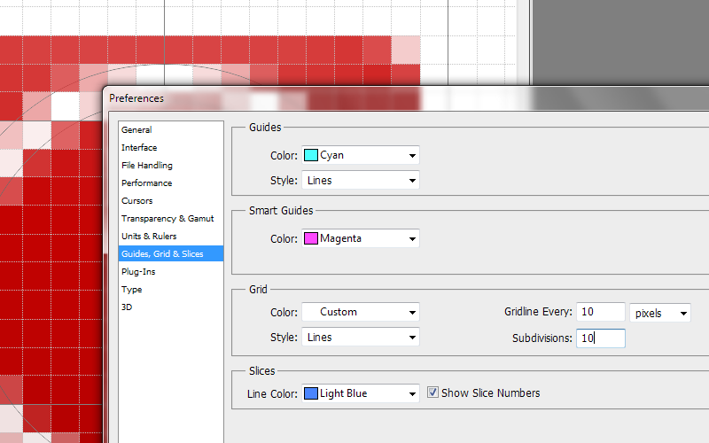 Figure 19. Open the grid preferences and change the values for 'Gridline Every' to 10 pixels and 'Subdivisions' also to 10.
You can now snap to the pixel grid by viewing it: 'View -> Show -> Grid' and making sure snapping is turned on: 'View -> Snap to -> Grid'. This is useful because we're doing stuff a bit differently now. There's nothing wrong with the free transforming process, so if you prefer this skip ahead. The curious reader stays with me.
With the 'Direct Selection tool (A)' (the white one) select the corner points and move them to pixel corners. I usually find this quicker to do when working with small stuff like this. And if you're drawing shapes yourself, this is a key skill. We'll not cover that here though. Simply move stuff around, zoom in and out extensively (Ctrl-1 gives you normal scale). Leave the oval dot to be treated with the free transform technique as this easily distort.
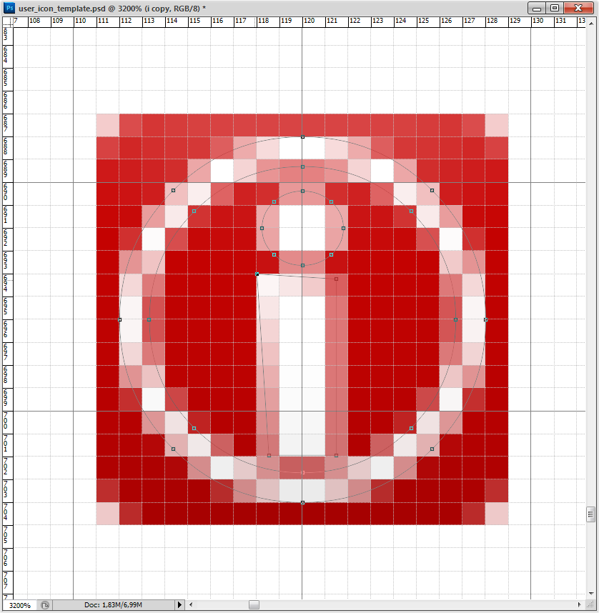 Figure 20. Moving the vector corner points individually.
I mentioned earlier the benefit of knowing the inside out of your icon shape, and this is evident in the dot in this case. If it's scaled to be perfectly round and as wide as the stem, it vanishes in a blur. By being true to the original design and benefitting from its qualities, the dot is better left half a pixel wider on each side. While not knife sharp (no curved shape can ever be that anyway), this is as good a result one can hope for at this resolution.
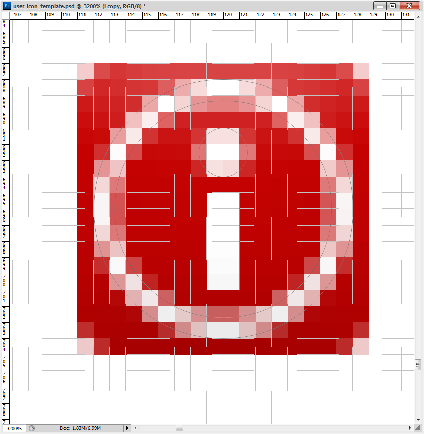 Figure 21. Final small icon.
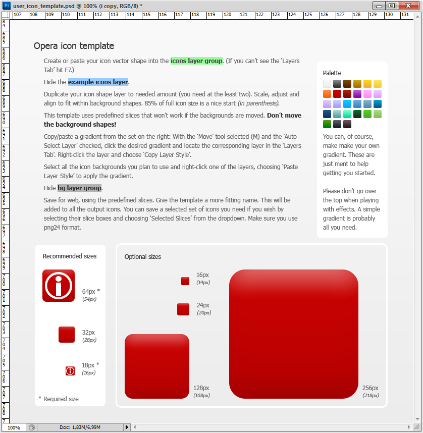 Figure 22. The icon shapes are finally tweaked and in place.
The palette
 Figure 23. The stock gradient palette.
To make your icon interesting, it must have a nice colour. And to make a color interesting, it should be made into a subtle gradient. A little set is providede in the template, but feel free to experiment on your own. For now simply click on one gradient you wish to try and note that the according layer is selected. Right click the blue area of that layer and pick 'Copy Layer Style'. Paste this effect by similarily selecting the background shape layers you wish to apply it to. You can select multiple layers and have all of them affected.
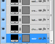
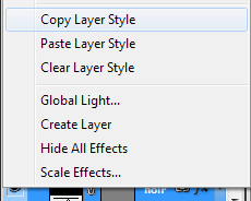
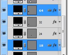 Figure 24. Copy/pasting the layer style of a palette gradient color.
Your icon should now look something like this and be ready for export:
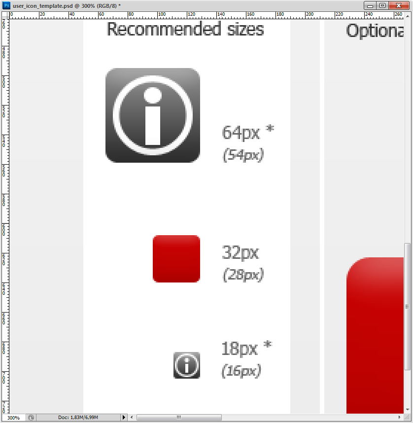 Figure 25. Final icons ready for export.
Exporting the icons
Hanging in there? This last part is very easy, as all the hard work is already done. First, simply hide the background layer by clicking the little eye icon:
 Figure 26. Hide the background layer.
Next click 'File -> Save for Web & Devices...' (Ctrl-Alt-Shift-S) and select the two icons you just made. It's a bit hard to see what's selected or not, but selected items get a brown border. Click 'Save' and give your icons a fitting name. Make sure to select a proper folder and select 'Slices: Selected Slices' in the dropdown. Hit 'Save', and you're done!
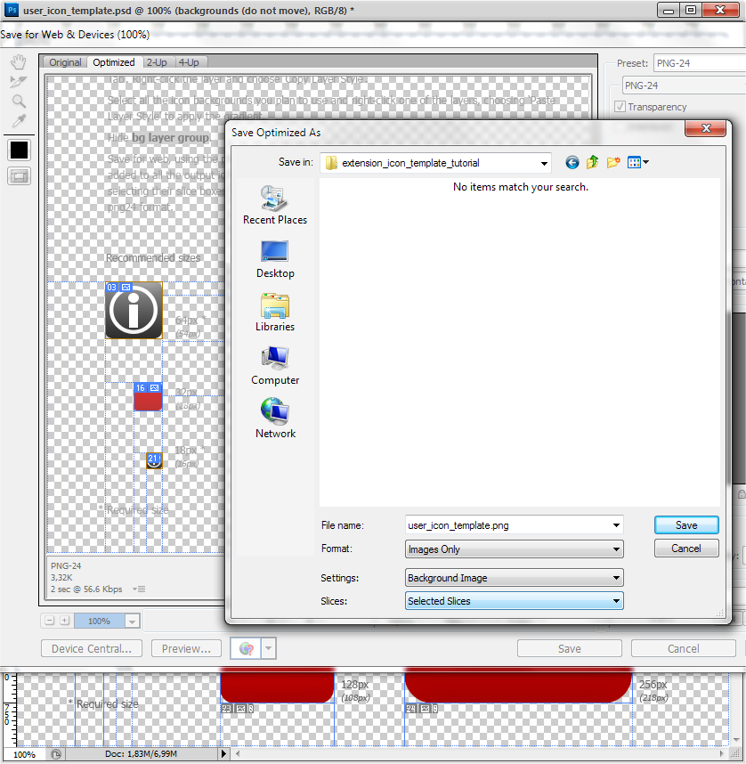 Figure 26. Exporting the icons. Congratulations! You're done!
Thanks for reading this! Hopefully it will contribute to a better looking world. Most likely it will not, but at least we tried. Right?